

HOTSPOT
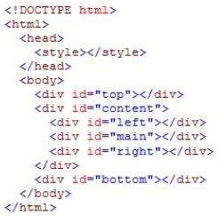
You develop a webpage. You create the following HTML markup:The layout of the webpage must contain three rows. The first row spans the entire width of the page and is
labeled #Top. The second row contains three columns. The first column is labeled #Left; the second column is
labeled #Main; and the right column is labeled #Right. The #Left and #Right columns are a fixed width. The
#Main column occupies the remaining available space. The third and final row spans the entire width of the
page and is labeled #Bottom.
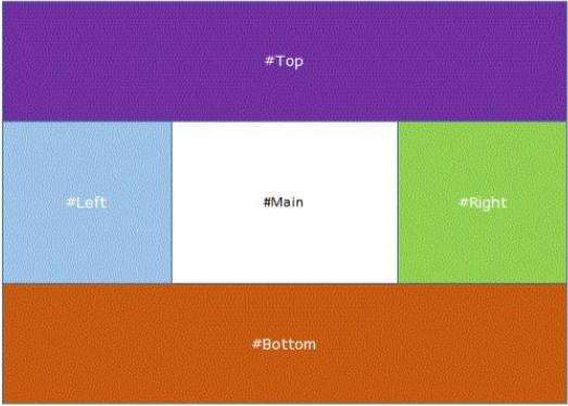
The layout of the webpage must resemble the following image:
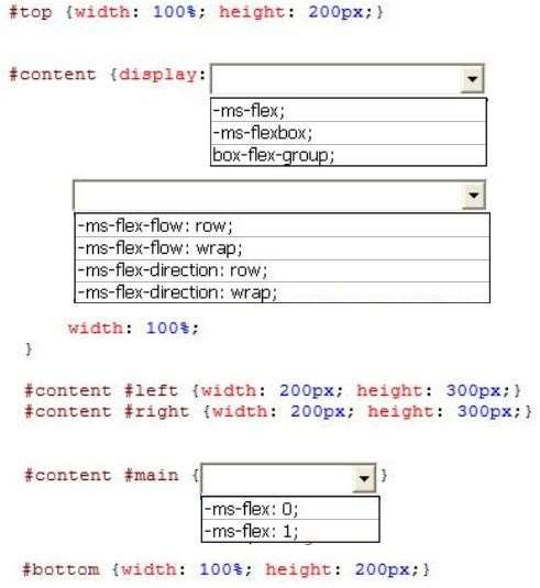
You need to create the CSS styles to implement the layout.
How should you complete the relevant styles? (To answer, select the appropriate option from each drop-down
list in the answer area.)
Hot Area:

Answer: 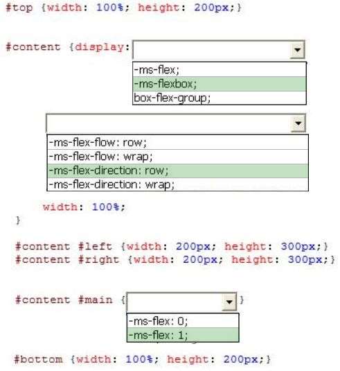
Explanation:
* -ms-flexbox
To enable flexbox layout, you must first create a flexbox container. Do this by setting the display property of an
element to either “-ms-flexbox” (for a block-level flexbox container) or “-ms-inline-flexbox” (for an inline flexbox
container).
* -ms-flex-direction: row;
When creating a flexbox container, you can also set its orientation—that is, specify whether its children are
displayed from right-to-left, left-to-right, top-to-bottom, or bottom-to-top.
* -ms-flex
Specifies whether the width or height of a child element is flexible based on the space available in the object.
This value also indicates the proportion of space available that is allocated to the child element.
Flexible box (“Flexbox”) layout in Internet Explorer 10